


The Offhours #36: Dream Mural pt2
Thoughts on design, art and living life while being a creative human.

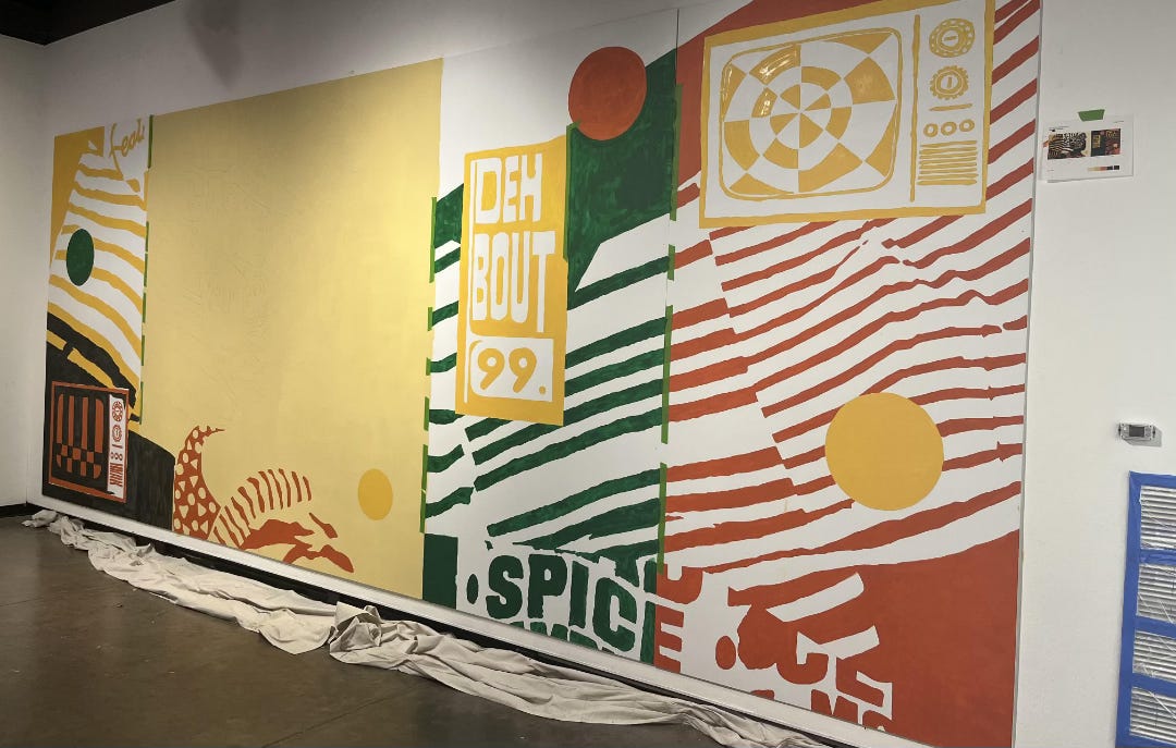
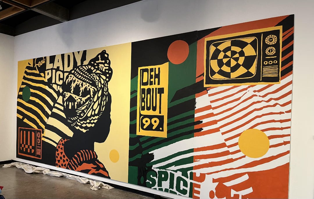
Deh Bout ‘99
Five panels. 25ft x 10ft. 46.5 Hours.
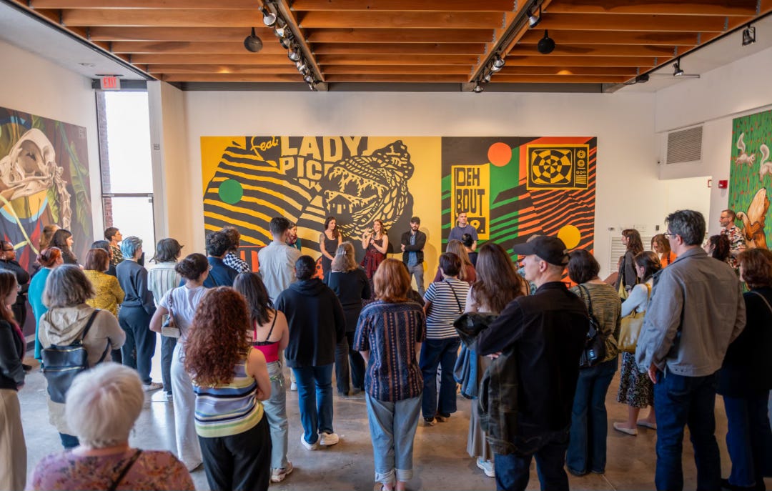
Over the course of a week, with help from two student mentees and a handful of revolving friends—the mural came to life (see part 1). The entire process was a test of patience and surety that it would turn out as it should. I was very open to it becoming a thing of its own beyond the sketches and mockups.
One of the most unexpectedly rewarding aspects of the project was that the installation remained open to the public throughout the entire setup. Folks wandered in and out students, faculty, support staff— and few stopped to ask questions, share impressions, or simply watch for a while.
I’m incredibly grateful to the team at Hartford Art School Galleries and the Hartford Art School for creating the space for this kind of work to happen. So happy to share space with other amazing artists—Peter Albano, Lindaluz Carrillo, Sophie Groenstein, Chris Piascik, Sophy Tuttle, and the late Tao LaBossiere, whose legacy in public art was honored. Lots of talented folks have gone through that school. I unfortunately could not make the opening, but I know all the pieces were well received.
Greatly humbled to be mentioned in a review by Jamil Ragland from the New Haven Independent:
“I was pleasantly surprised by the subtlety of Vaughn Fender’s mural. The piece seems straightforward at first, featuring a Black woman looking off into the distance and televisions in the upper right and lower left corners. The color scheme is evocative of much of the art of the African diaspora, although it noticeably omits red in favor of yellow and orange, which gives the artwork a calming feeling that seems more like a yearning for home than a statement about the violence of the diaspora, which so much art tends to focus on.
In fact, that calming sense almost makes it easy to miss the actual use of some violent imagery, hidden masterfully in the headwrap of the central figure.”
- Jamil Ragland
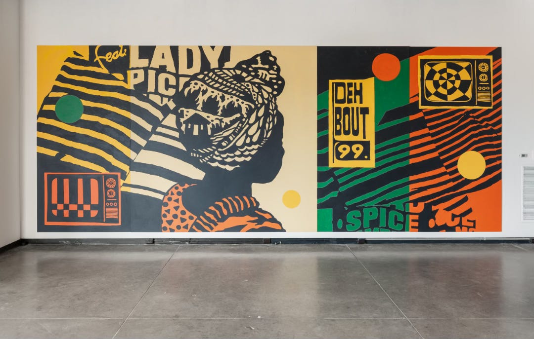
The write up was pretty spot on, and I loved that they gave a name to the piece. For me, the mural explores soft power and influence. The TVs are modeled after the ones I grew up with—boxy, large, and with dials. They are positioned in a yin-and-yang formation to symbolize balance around the central figure. The patterned lines bleed across like a haze or fog, with hand-drawn elements inspired by the reggae and dancehall posters I grew up seeing on light poles. The language and colors ground the piece in its Caribbean roots and reflect the transition I made coming here. The figure, while framed as a silhouette, carries their own story in response to the other elements. Their perceptions also influenced by consumption.
More to come.

👋🏾 Hi, thanks for reading The Offhours, a newsletter on the creative experience outside of full time gigs, deadlines and self imposed schedules. You’re amazing, tell a friend. Stay Wonderful.
Well done! I love the composition of this piece. The two “vintage” TVs remind us that there was a time when news went off the air, forcing us to take a break and find other ways to entertain ourselves.
Wow, that turned out amazing. Love the story and meaning you put into the headwrap. Overall, I get a feeling of wistful longing from it.
I remember watching Saturday morning cartoons on those old TVs. No remote—just 2 big dials and 3 smaller ones below. Had to get up off my ass to change the channel!
Hoping there are many more murals in your future!