


Offhours Weekly 23: Begin, Again
Drawings, Quotes, Lettering & Notes.
👋🏾 Hi, Welcome to The Offhours Weekly, a share of illustrations, drawings, thoughts and links. Thanks for being here, you’re amazing, tell a friend.
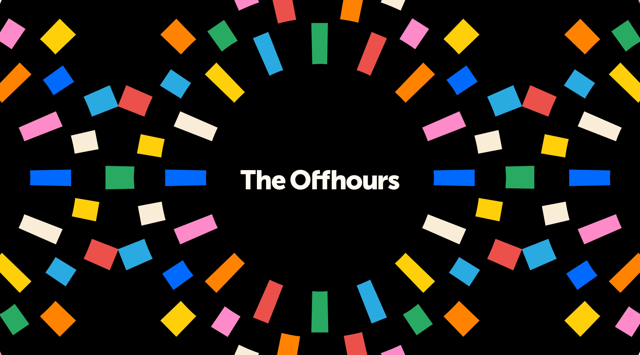
2024 is going going. I’ve been thinking about goals for this year and the maintenance of this newsletter. At this point I’ve been writing these issues for over 15 weeks now and thought it would be good to update the newsletter with a fresh icon, word mark and color palette. The designer side of me loves a good branding project—even on small scale.
I’ve always felt that the best work happens offline, in the offhours, when you are not intentionally focused on solving a problem. Ideas find you while you are taking a walk, reading, watching a program you love etc. Hence the newsletter name—The Offhours. I do my best to maintain a practice outside of my 9-5, to stay inspired and fulfilled.
I love a good time themed movie/series - Loki, Interstellar, Back to the Future, Run Lola Run, Timecrimes - love them all. If it’s one thing I’m reminded of watching these shows is that you have to make use of what you have. Time is precious, and we should all be weary of how we invest it. The inspiration is now engrained as I often draw representations of time—without realizing.
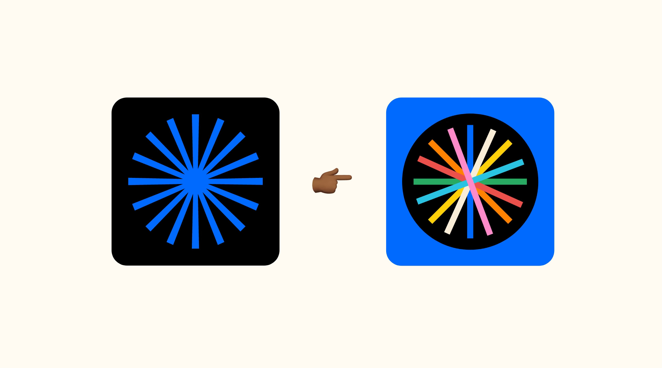
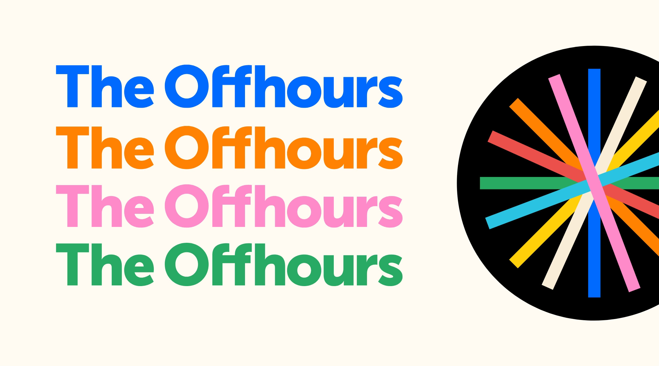
Simply put, the newsletter icon represents time, as the blue star burst references the points on a clock (but with speed), and captured the visual foundation of the idea thematically. To expand and refresh this, I wanted to keep the basis of the idea, but add more dimension to it. The blue and black by itself was feeling too dreary for me.
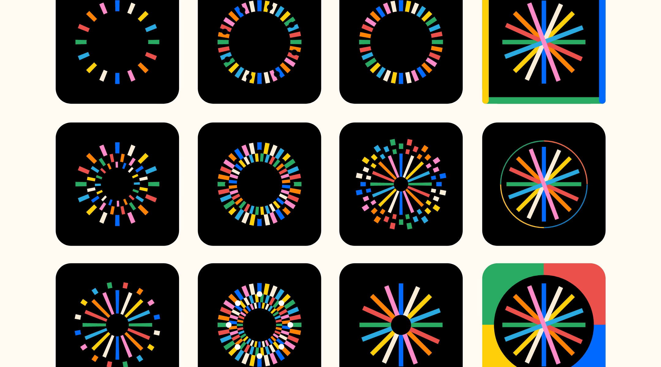
I went through a few iterations to keep the concept intact, while trying to add more visual punch and detail. The ideas were straying too far from the core idea and getting too complex, to read at a small scale. Great thing about having explored all these ideas is that I can repurpose them for other uses, like the card at the top of this post.
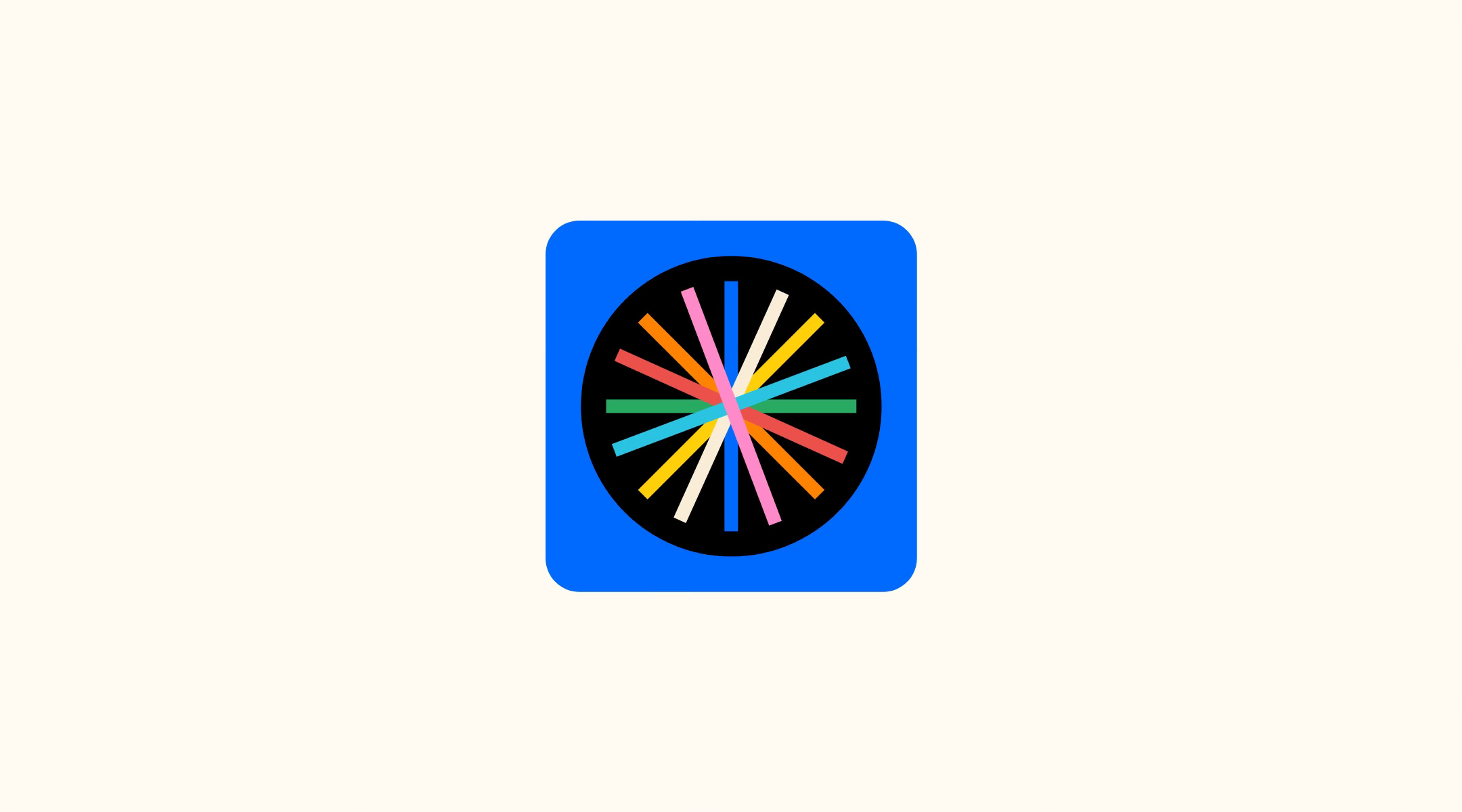
I landed on the final version after stripping away most of the details and just focusing on the colors. It didn’t need too many tricks, it just needed a little push. It still has the original blue and black to keep some essence of the original, while leaping forward with the expanded palette, which I think adds to the broader notion of work—in reflecting the exchange of energy and moods.
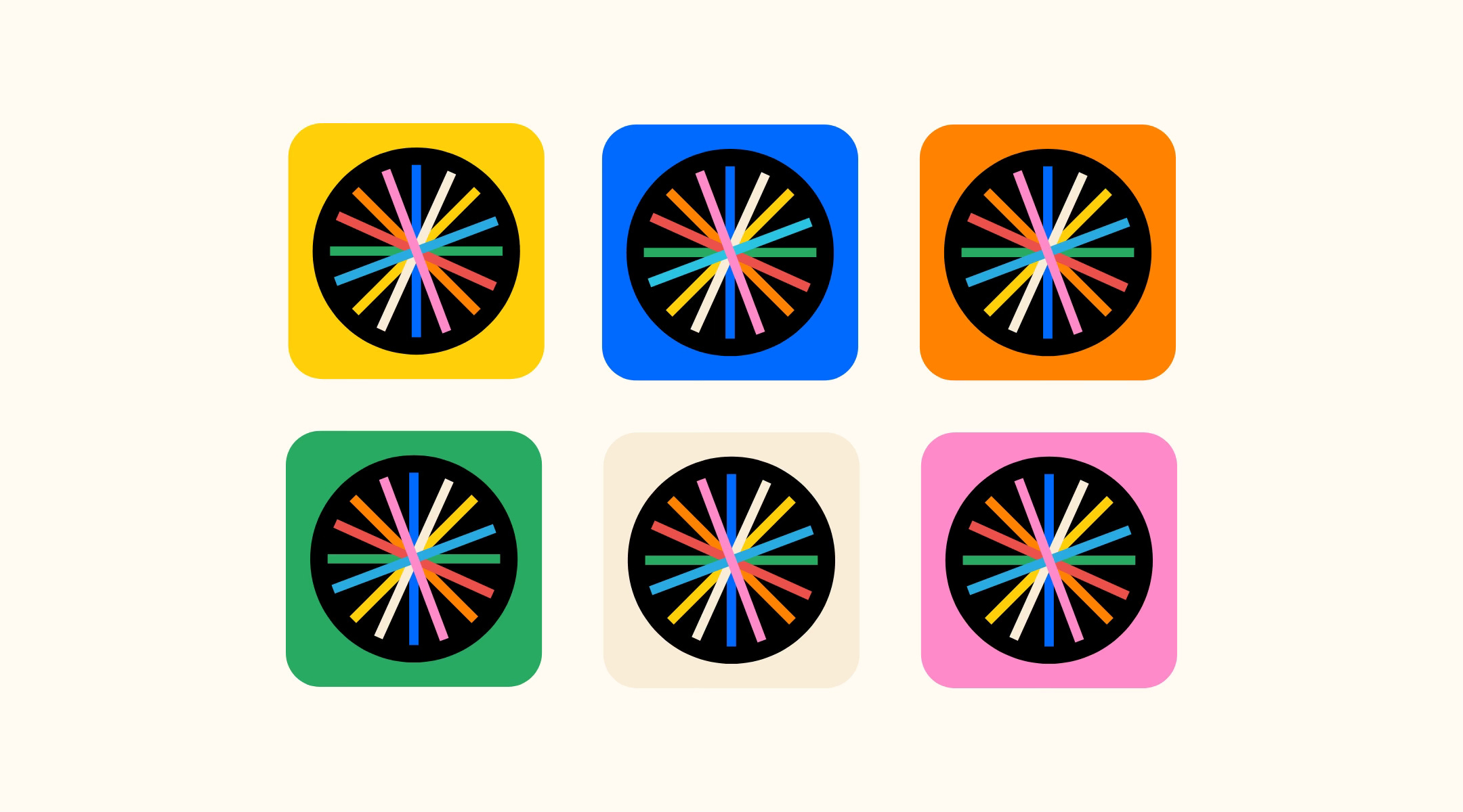
The supporting card that you see when you subscribe, I kept the same. This card hints at the ‘mystical nature’ of creativity—unlocking ideas, zoning out, the luxury of time etc. Again, referencing the progression of time. I do like the mood it sets up. I’ll probably update the colors at another time if inspiration hits.
I use Museo Sans for the word mark, and only made a slight adjustment to the first ‘f’ by trimming the cross bar and moving the ‘O’ closer, for a more snug, clean fit.

This newsletter is a work in progress. Each week that passes I get more insight into what id like to do and where id like to take it. At the moment, the goal of this newsletter is to:
Provide insight into maintaining a creative practice: Sharing my work, experience and process
Share advice on building a creative practice of your own: Everyone needs a creative outlet
Share industry knowledge, tips, tools and resources
Create community and connection through creativity
My experience teaching a senior level design college class - taught me that there is a lot to learn that goes unsaid. My students would ask me for deeper, real world insights about their design careers and industry at large. I’ve gotten questions from other designers and artists about how I go about doing my work and problem solving. I’m always open to sharing my knowledge, as much as I am eager to learn.
The industry can feel really siloed, and I want to have a space that’s open, talks about process and failures in contrast to the perceived success we view on social media.
This year I have a few deep dive issues in the works:
✍🏾 Journey to Art Series (4): Where I talk about how I got into art and illustration.
✍🏾 Starting and Maintaining a Creative Rule Based Practice: Tips and insight into building your own practice.
✍🏾 Case Studies (3): Behind the work, where I go into detail about three specific types of freelance client projects (design, illustration and lettering).
✍🏾 Resource Drop - Lists and lists of useful books and links.
I’m looking to hear from you if you have and ideas or suggestions. Just reply to this email.
This newsletter is FREE, but I have paid subscriptions on if you are interested in pledging your support (which comes with goodies). I am super grateful for your continued—reading, liking, reposting, sharing, telling a friend etc. It really keeps me going, continuing this practice and creating these issues.
More links and tings next week! Thanks for subscribing.
Stay Wonderful.